Responsive Web Design Intro
Responsive Web Design is the belief that design and development of the site should respond to the user based on orientation, environment, and platform. This has become increasingly popular due to the increased amount of people using mobile devices over the past 5 years. Media queries are media modules used to render and adapt to screen conditions such as screen resolution. Break points are the different sizes and variations of screens allowing the page to fit on them without cutting off parts.
As you can see I've used the Apple website to provide examples on good uses of responsive web design.


As you can see I've used the Apple website to provide examples on good uses of responsive web design.
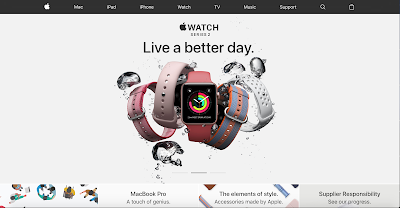
This is the full screen window size for the Apple website. As you can see the top bar has all of the options on it as well as the advertising that runs across the bottom.

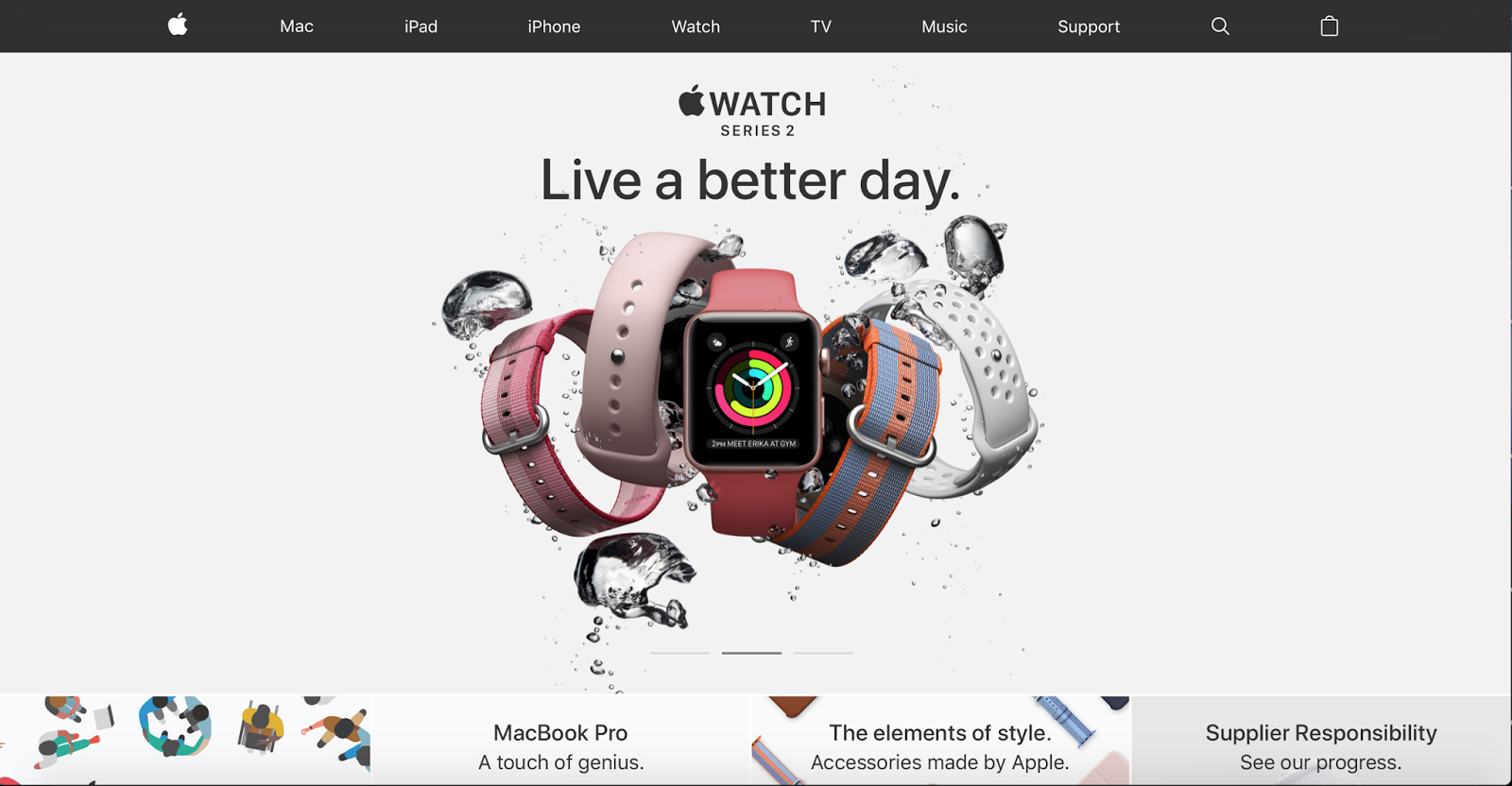
This is half screen for the Apple website and while it still has the top bar with all of the menus and the advertising on the bottom it is much more cramped.

This is the "iPad" equivalent to the sizing of the Apple website. There is no longer all of the options on the top, instead having the lines on the side where a drop down menu appears. There is also no wording on the bottom of the advertising.

Comments
Post a Comment